Gerber

Nestlé

Elevating a traditional product to cater to today’s parents

After 90 years, Gerber faced the daunting challenge of appealing to the modern mom and dad. As traditional baby food loses shelf space to new organic competitors, Gerber needed a way to remain relevant with health-conscious, time-crunched parents without leaving nearly a century of equity on the table.

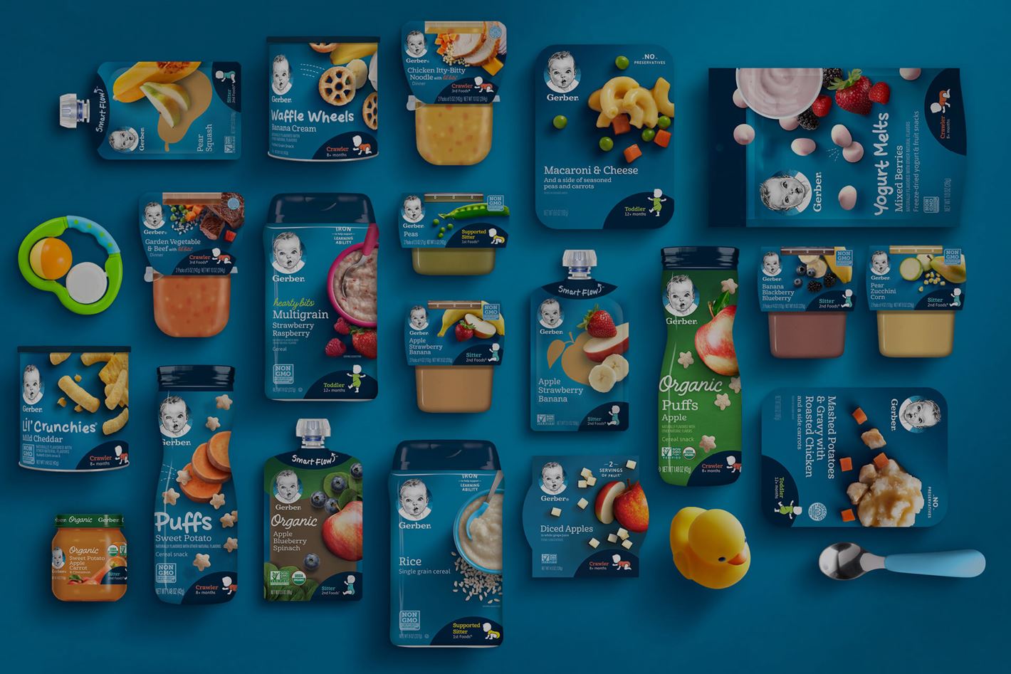
Keeping the heart of a well-known brand with updated packaging and products

Embracing a commitment to real food, the updated brand identity dials up Gerber’s signature blue, creating a textural backdrop that celebrates premium ingredients photographed in true-to-life perfect imperfection.

Empathizing with the challenges of shopping for a baby, the packaging design provides clear navigation, stage milestones, and simplified information for on-shelf presence. A conversational voice offers support directly on the packaging, connecting good food to good feelings.

Redesigning a universally relatable icon that truly reminds you of home

Consumer research revealed that moms across diverse ethnicities and backgrounds saw their own little one in the iconic Gerber baby. This profound insight guided refinement of the original charcoal sketch logo, deepening its equity, character, and relatability. Giving moms peace of mind. Empathizing with the chaos. Making life easier.