Designing the spirit of discovery

Portage

Portage is inspired by Canada’s wanderers, both old and new. Nonetheless, its story begins in 19th Century Britain with the rise of London Dry Gin—a strict distillation process that creates a versatile and smooth taste. Portage brought this practice to its distillery on the banks of Montreal’s Lachine Canal. In doing so, it fused the United Kingdom’s tradition with the New World’s sense of discovery.

We created a visual identity that honours this connection and the element it’s founded on.

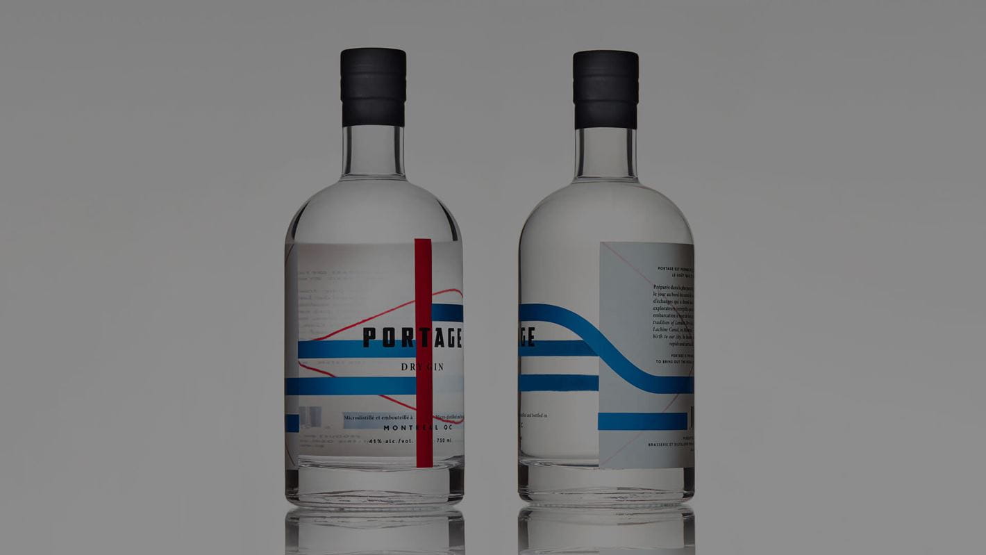
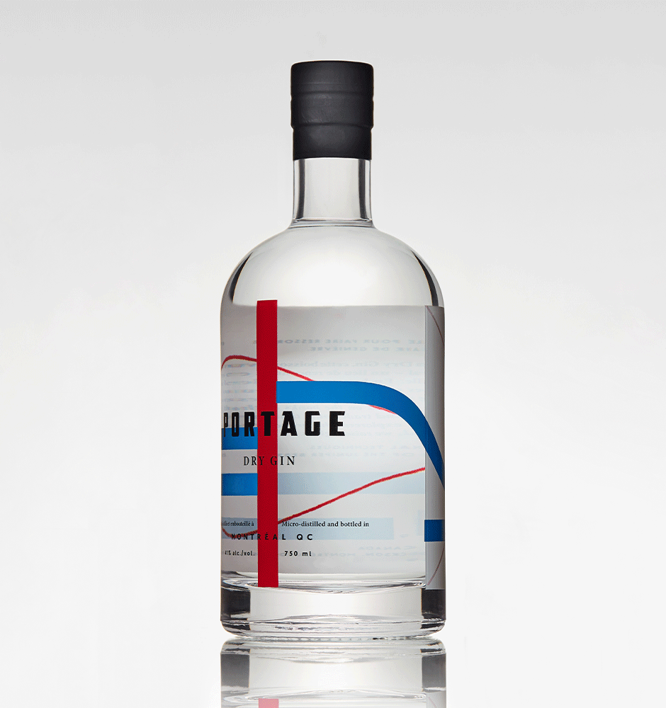
Portraying voyages across water

The 19th century was a period of great exploration for early Canadians, who traversed the veins of Canada’s waterways by canoe. And it was water that brought the centuries-old gin traditions from the United Kingdom to the banks of Québec.

To symbolize these journeys, we designed flowing blue lines that encircle the bottle. The remaining colours, white and red, are a homage to the Union Jack, the de facto flag of the United Kingdom. We also drew inspiration from the colours and shapes of maritime signal flags, the beacons that led many of our sea-worn ancestors home. In keeping with this nautical mythos, we also used hand-painted cruise advertisements from the 1930s as inspiration for the typography.

And evoking the unexplored

We left the remainder of Portage’s bottle a blank slate. A window into wherever the adventurer brings it—of canoes, rivers, mountainsides. The casing also contains a cut-out canoe paddle so one can get a slight glimpse of what lies on the other side.

“To all the intrepid explorers who braved the rapids and carried their crafts overland, we raise our glass.” — Portage