A walking tour of Sid Lee’s International HQ
So, you want to see the brand new** Montréal office.

**Well, the truth is that we’ve known about it for a while now. We’ve actually been designing, writing, accounting, and brainstorming in this space for about a year. But, like 800 dogs with treats nestled neatly on their snouts, we weren’t allowed to show anyone. Torture! Until now.

As the official release is upon us, we invite you on a virtual walking tour. A pleasant scroll adorned by Maxime Brouillet and David Boyer's photography and our communications department’s honest stab at translating architectural lingo into everyday language.

We’ll begin with Sid Lee Architecture’s intentions, how they came to life in stunning detail, and conclude with a peek at some of our fabled meeting rooms.

Let’s go.


The blueprint

PVM has the bones of a banking building. In reimagining the space, Sid Lee Architecture aimed to transform it into a haven for collaboration and artistry. Such spaces require light, life, and spatial drama. Well, maybe they don’t require drama. But we asked for it.

Its location was also essential: the heart of downtown Montréal. For practical reasons, like easy commutes for artisans and quick airport jaunts for international clients. But also for something deeper: a tap into the wellspring of downtown life. Sid Lee has long lived on ground floors—from Los Angeles and Toronto to London and Amsterdam, we like to soften the partition from outside and in.

Designing and programming began in 2015, and the final touches of construction ended in Fall of 2021.

The Ground Floor

Blink, at you might miss that you’ve entered the office. Kind of like the city caught on your jacket and stayed for the ride. Straight across the entryway you’ll see the Esplanade, Place Ville Marie’s major outdoor gathering space that hums with the foot traffic of urban life. The ground floor’s dominant material is mineral; large monoliths of bush-hammered stone rise from the bistro and cafe, walls burst with tropical plants. If it weren’t for the digital elements, you might believe you’d wandered into some sort of lush cave system that happens to have an Espresso machine. This is perhaps why strangers do wander into the bistro and ask why we aren’t making them Americanos.

The Biosphere

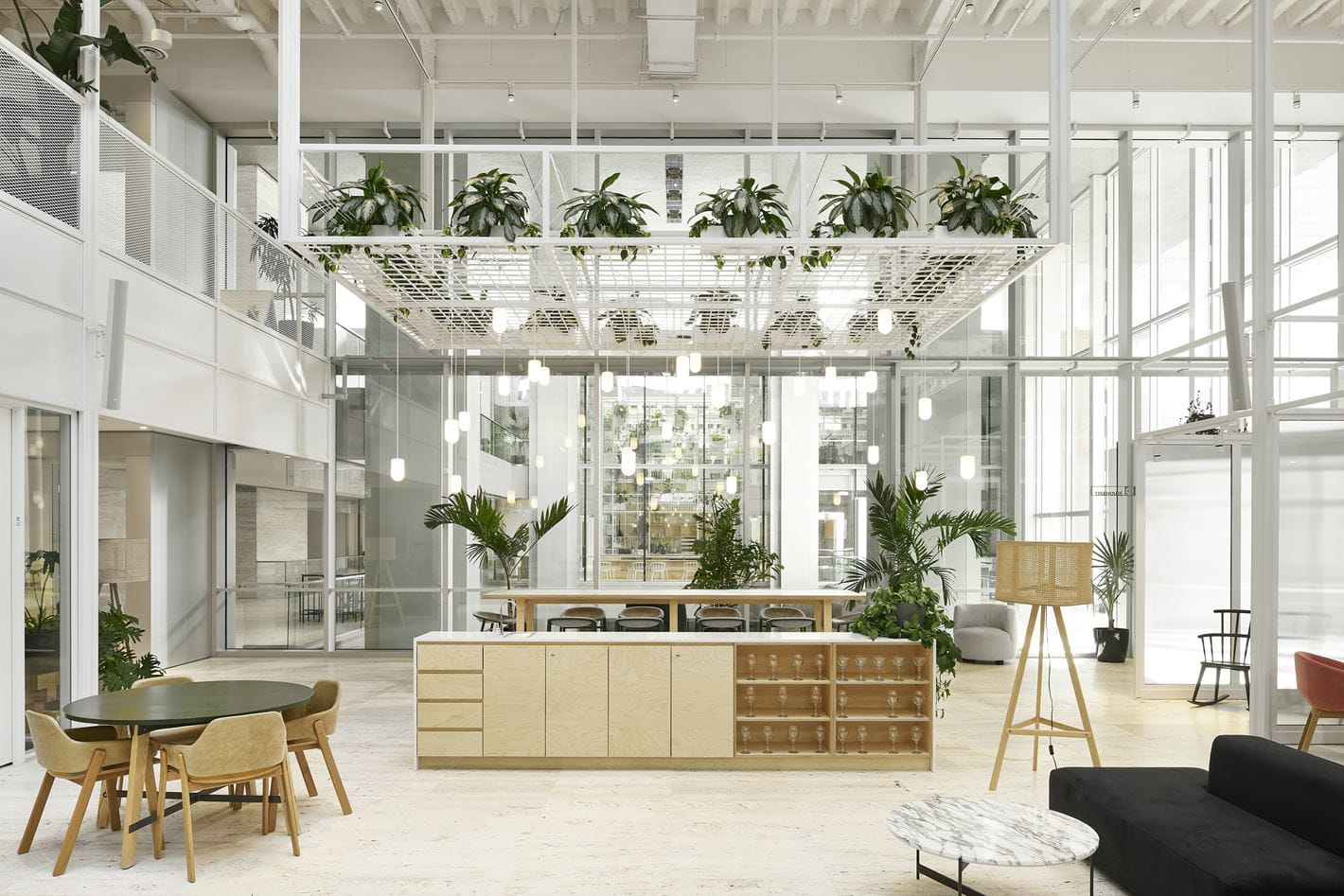
As we ascend the stairs to Mezzanine 1 and 2 the Biosphere emerges, and with it a flush of light and space. This expansiveness is achieved by an interlocking metal structure that organizes the space under gigantic skylights resting over 7,000 meters from the ground. The biophilic design, which refers to the omnipresence of plant life and the flow of the space in conjunction with it, mixes with the modernist qualities of the building. This heritage manifests itself through the revaluation of some of the original materiality that had been altered with throughout the years.  At the center of Mezzanine 1 rests the Agora, the central meeting space. An ideal zone for 3PM concerts, meetings, and for Sid Lee Canada CEO Martin Gauthier to perform karaoke in drag.

The Meeting Rooms

The kind of ideas that win Cannes Lions aren’t typically generated in windowless boardrooms with overhead lighting fit for dentistry. Perhaps you need a room reminiscent of a 1970’s psychotherapy office to free your subconscious. Or to let off some steam with a punching bag. Pretend you’re on the moon? Whatever it is, PVM has it covered.

Next stop, IRL

Thanks for the virtual company. It's much more impressive in person, of course. Would you like to see? For more professional coverage of PVM, check out Wallpaper, dezeen, and Frame.